Athena Vimal

'airbuds' app redesign

Social Media for music.
background
A fun, innovative app that allows users to share what they are listening to with friends, analyze their own listening habits, and interact with others through reaction stickers and more.
context
As an avid user of the app myself, I wanted to take on the role of rethinking its UX and product design to imagine the app in order to further maximize its unique features.
timeframe
my role
6 Weeks
UX + UI Design, Visual Design, Product Design, Prototyping, Researching
tools
Figma, Canva, Goodnotes
the challenge

Users need easier navigation and accessibility.
App needs an increase in user retention.

While the app boasts multiple features (reactions, Q&A, music recaps, “spaces”, etc), the way the app currently navigates through them may overshadow its accessibility.
Another noticed pressing pain point is the loss of continued engagement. While initially the app presents itself as very exciting, interest declines. This problem is one that has been consistent after speaking with many users of the app. (User Attrition and Engagement Decay)
solution + approach
Redesign Navigation
Reduce Scrolling
Research User Engagement
Redesign navigation to become more straightforward and obvious to highlight key features (Information Architecture and Navigation Optimization redesign)
Through redesigning navigation, reduce the amount of scrolling as to not exhaust users.
Research methods on how apps keep users engaged overtime and ask current users what would keep them actively using the app.
market + user research
Time Spent Using App
Element of Gamification
Social Component
Users may not spend as much time on the app regularly, leading to decline of value of using it over time.
Adding or honing in on an element of Gamification in apps can retain user retention and extrinsic + intrinsic motivation. There are currently leaderboards on the app, but they do not stand out as a prominent feature. Considering that, adding these may not be as motivating for users.
Having a social component is seen to increase engagement. Currently there are some aspects of a social component, but how can we take that to the next level?
When surveying the app's current users, many said that adding a "shared playlist" or song sharing component would be an enticing addition (also adding an additional social component).
initial sketches + ideation
-1.jpg)
*This idea was not incorporated in the initial design as speaking with users revealing it to be not an enticing enough addition.
initial brainstorming and ideation


initial layout sketches
low fidelity wireframes
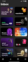
"inbox" page

before

after
The navigation of all sections of the Inbox page require a decent amount of scrolling to access it all. This wireframe showcases a simpler and easier-to-digest layout that is also more visually appealing. The "Reactions" and "Q&A" that were previously scattered around the page's layout are now condensed into the screen's cohesive format.
"friends" page


before
after
Similar to the Inbox page's layout, this wireframe details a design that is more visually consumable with enlarged images and text. This version also highlights the user's friends' current/last listened to song rather than displaying the last sent message, keeping cohesive with the app's focus on sharing music with friends.
"recs for you/from friends" page

Since this was a new feature I designed, I had no previous screen to base this layout off of. So, I attempted to keep with the app's consistent use of rectangular elements to envision this page. The "Import" button at the top right corner is a feature of this page that I imagine exports its data and creates a playlist on the user's streaming service (Spotify/Apple Music) that is connected to the app. I was inspired to make this addition by the requests of surveyed users, as well as by the app's current feature of playing a song on the user's selected streaming service through clicking a "Play On ____" .


Mockup of "+" button's menu of its homepage to include the sending a song action of the "recs from friends" feature.
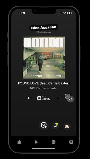
Airbuds Homepage

Mockup of the "recs from friends" button cover on the Inbox page, with its featured icons customized to each user.

Example of the app's current push notifications and a mockup of a push notification for the "recs from friends" feature.
high fidelity wireframes


prototype walkthrough
This prototype showcases:
-
Redesigned "Friends" Screen
-
Redesigned "Inbox" Screen and new locations of "Reactions" and "Q&A" sections
-
New "Recs For You" Screen
testing and feedback
To gather feedback on the usability of the new layout and features, I surveyed 5 current users. The metric I used to measure success was by asking users to rate on a scale from 1-5 of a few different factors:
1. The visual appeal of the new layout compared to the current.
2. The ease of navigating through the new "Inbox" page.
3. The usefulness of the new "recs from friends" feature.
4. The ease of using the new "recs from friends" feature, including how to send a song from the homepage menu.


current

new
The feedback from users was enormously positive, with users consistently rating each metric for success either a 4 or 5. However, there was some suggestions about the limited abilities of the "recs from friends" feature.
Users expressed that currently they were only able to send songs that appeared on the homepage and their feeds. So in order to adjust that, iterating the feature to include a search bar to find and send any song is an addition I believe could be beneficial.

* This wireframe demonstrates how a vertical scroll downwards would reveal the "Send a song" search bar, allowing users to search a specific song to send to friends' "recs for you" inboxes.
reflection + refinements

This project is one that was I found incredibly valuable and teaching. This process was the first time I've really utilized Figma for a task as layered as this. Though I had limited resources doing this as a self-started project, I learned how to go through the basic steps of UX/UI designing from sketching to wireframes to prototyping.
If I had more time and resources available, I would continue expanding and iterating the "recs for friends" feature to fully develop the "Import to Streaming Service" button, fleshing out the capabilities of the feature entirely. I believe that this aspect of the app is one that would continue to add to Airbuds' appeal. Through this feature, songs users share with friends are in one location that is convenient to access and listen to. Its uniqueness increases the app's social component (which could increase user retention according to market research), expanding beyond the constraint of differing streaming services and linking users together to share their love of music.
Yet, there are still many additions to be made and many I have already thought of after initially completing this project. Some refinements that I will continue to design upon are to add a way to delete a song off the page (so users can dismiss after listening, to not show up on the page and imported playlist). Also, adding a feature for users to send reactions for expressing to their thoughts to the recommended songs to whoever sent them.
To test the success and effectiveness of this feature, I think the metrics for the use of this feature compared to others on the app could be potentially measured along with continued use of the app overall.
Although there were many large aspects I had to tackle taking on this project, I was taught the utmost importance of paying attention to detail when it comes to designing for users. Through reconsidering some of the app's layout and designing additions of the app according to user needs, I believe I've found an improved version to some of Airbuds' current weak points.